
What Font Am I Quiz
How the Scales are Structured
Who Usually Takes This Test?
See How You Compare
Below is a preview of how scores are typically distributed across each scale.
Example Questions From the Test
- Replace it with a completely new approach
- Keep its meaning while thoughtfully adapting the details
- Simplify it until only the useful parts remain
- Retain the most memorable parts and make the experience warmer
- Observe first and seek one thoughtful conversation
- Help clarify introductions and practical details
- Join an active group and add energy once I understand the mood
- Break the ice with a story, game, or playful question
- Write a reflective note about what their friendship has meant
- Keep it brief, sincere, and easy to read
- Mix affection with an inside joke or playful visual flourish
- Choose a warm message and add one colorful personal detail
What Font Am I Quiz - Description and methodology of the test
Readers who enjoy design, communication, and visual self-expression can use this light questionnaire to connect everyday preferences with recognizable typographic personalities. As a what font are you quiz, the questionnaire asks which font you are most like in everyday situations and invites reflection on visual and communication preferences without requiring design expertise. The What Font Am I Quiz gives those choices a profile that can make personal style easier to discuss.
What This Assessment Explores
Each typeface is a metaphor, not a typography test. Situations reveal preferences in expression, order, reflection, craftsmanship, novelty, and communication. This font personality quiz creates a profile.
The four dimensions are:
- Cooper Black (0-12) shows a playful, sociable, expressive, warmly unconventional affinity: Reserved Contrast (0-4) favors restraint; Playful Accent (5-8) brings warmth; Cooper Black Affinity (9-12) is joyfully expressive.
- Futura (0-12) shows a geometric, inventive, optimistic, future-facing affinity: Grounded Contrast (0-4) favors proven methods; Modern Spark (5-8) welcomes experiments; Futura Affinity (9-12) energizes bold possibilities.
- Garamond (0-12) shows a thoughtful, literary, warm, enduring affinity: Contemporary Contrast (0-4) favors other energies; Classic Undercurrent (5-8) values tradition; Garamond Affinity (9-12) favors reflective detail.
- Helvetica (0-12) shows a direct, balanced, adaptable, uncluttered affinity: Expressive Contrast (0-4) says clarity rarely defines personal style; Clean Current (5-8) values order; Helvetica Affinity (9-12) favors functional elegance.
Methodology and Evidence Base
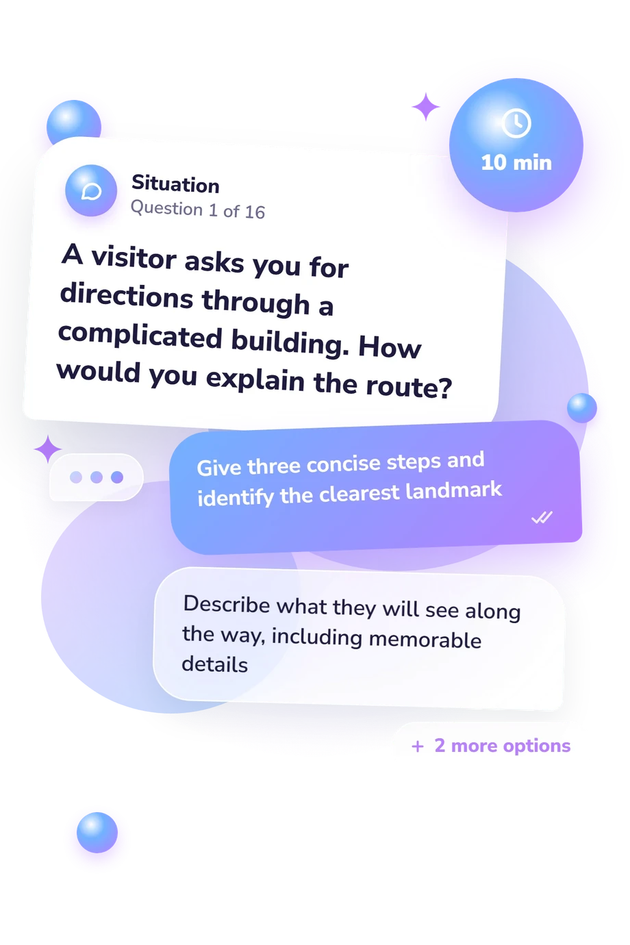
Each of the 16 prompts presents a situation with four response options. Responses produce four displayed typeface-affinity scores, with no separate point value stated for each option.
Results are comparative: the highest score shows strongest affinity, and any score within one point of it is part of a blended result. The outcome therefore describes relative preferences rather than a fixed identity.
Methodologically, the closest conceptual match is work by Shaikh and Chaparro on perceived font personality and appropriate uses. Research by Serrano Sanz addresses Helvetica’s visual identity and neutrality, while Brumberger treats typeface as part of a text’s rhetorical persona. This questionnaire is conceptually consistent with those works, not an adaptation or validation of them.
This typeface personality test offers a prompt for discussing communication habits and aesthetic choices. Its scenarios cover practical explanations, social coordination, personal spaces, messages, technology, tradition, and creative work. It is an online self-report profile, so mood, context, scenario interpretation, and candor can affect responses. Read the scores as reflective tendencies, not a diagnosis.
- Serrano Sanz, Luis Fernando. Helvetica: Visual Identity and Typographic Neutrality. Doctoral dissertation, Universidad Camilo Jose Cela, 2015.
- Shaikh, Dawn, and Barbara Chaparro. "Perception of Fonts: Perceived Personality Traits and Appropriate Uses." In Digital Fonts and Reading, edited by Mary Clare Dyson and Ching Y. Suen, 226-247. World Scientific, 2016. 10.1142/9789814759540_0013.
- Brumberger, Eva R. "The Rhetoric of Typography: The Persona of Typeface and Text." Technical Communication 50, no. 2 (2003): 206-223.
Updated: