
Color Blind Quiz
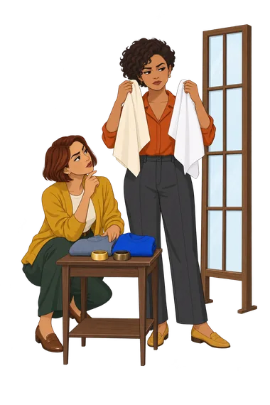
How the Scales are Structured
Who Usually Takes This Test?
See How You Compare
Below is a preview of how scores are typically distributed across each scale.
Example Questions From the Test
- Neither is especially convincing; cooler metals are usually more harmonious.
- Light yellow gold usually adds a clear, healthy-looking warmth.
- Yellow gold can work, but only when it is subtle or mixed with another metal.
- The deeper antique finish is usually better than bright yellow gold.
- Rarely; cool silver or bright white metal is much more convincing.
- Sometimes, mainly in small pieces or mixed-metal designs.
- Often, though extremely dark or orange-toned finishes can be too much.
- Very often; their warm, softened depth looks naturally at home.
- Ecru is noticeably more harmonious, while optic white can look detached or severe.
- Ecru has a slight advantage, but optic white remains wearable.
- Optic white is usually better, although ecru can work with darker accessories.
- Both look disappointing; I generally need a cooler soft white instead.
Color Blind Quiz - Description and methodology of the test
For readers choosing clothes and accessories who want a clearer sense of personal color harmony, this color blind quiz offers a structured seasonal profile rather than a medical screening. It is suited to self-observation when you are unsure whether warmth, coolness, softness, clarity, depth, or contrast best supports your appearance. The result can also show whether a seasonal color quiz description feels consistent with the colors you already enjoy wearing.
What This Assessment Explores
The questionnaire connects your perceived coloring with clothing, accessory, and outfit choices. It looks across warmth, coolness, lightness, depth, softness, clarity, and contrast through comparisons involving metals, neutrals, vivid and muted colors, prints, and complete combinations. In that sense, this colorblind quiz describes styling affinities rather than assessing color-vision deficiency.
The four displayed result dimensions are:
- Autumn Palette Affinity (0-12) reflects promise for warm, rich, muted shades: Limited affinity 0-4; Possible affinity 5-8; Strong affinity 9-12.
- Spring Palette Affinity (0-12) reflects promise for warm, light, clear shades: Limited affinity 0-4; Possible affinity 5-8; Strong affinity 9-12.
- Summer Palette Affinity (0-12) reflects promise for cool, light, soft shades: Limited affinity 0-4; Possible affinity 5-8; Strong affinity 9-12.
- Winter Palette Affinity (0-12) reflects promise for cool, deep, clear, higher-contrast shades: Limited affinity 0-4; Possible affinity 5-8; Strong affinity 9-12.
Methodology and Evidence Base
Each item presents a familiar appearance comparison followed by four descriptions of how the respondent usually reacts. The choices vary temperature, depth, clarity, softness, and contrast across metals, colors, neutrals, prints, and outfits, making the task a pattern-based self-report rather than a single-preference choice.
Scores are produced separately for the four seasonal directions and then compared. A leading result within one point of another is shown as blended, recognizing overlapping qualities. The displayed score logic is comparative, not pass-or-fail.
The framework is conceptually consistent with Color Me Beautiful (Jackson, 1980), which popularized four-season personal color guidance. Cassidy (2007) connects personal color analysis with colour preferences and fashion practice, while Hong and Kim (2019) demonstrates a mobile assessment format. These sources provide context for the model, not validation of this exact questionnaire.
Because the result depends on lighting, current context, memory, and self-perception, it is best used as styling guidance rather than a normed clinical measure.
- Jackson, Carole. Color Me Beautiful: Discover Your Natural Beauty Through the Colors That Make You Look Great & Feel Fabulous! Washington, DC: Acropolis Books, 1980.
- Cassidy, Tracy Diane. "Personal Colour Analysis, Consumer Colour Preferences and Colour Forecasting for the Fashion and Textile Industries." Journal of the International Colour Association 1, no. 1 (2007): 1-14.
- Hong, Hye Rim, and Young In Kim. "A Mobile Application for Personal Colour Analysis." Cogent Business & Management 6, no. 1 (2019): Article 1576828. 10.1080/23311975.2019.1576828
Updated: