
What Color Eyeshadow Should I Wear Quiz
How the Scales are Structured
Who Usually Takes This Test?
See How You Compare
Below is a preview of how scores are typically distributed across each scale.
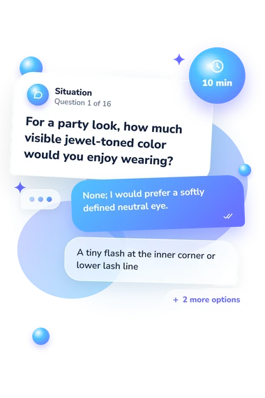
Example Questions From the Test
- None; I would prefer a softly defined neutral eye.
- A tiny flash at the inner corner or lower lash line
- One noticeable emerald, violet, or blue accent
- A saturated jewel shade as the clear focus of the look
- A softly defined matte taupe eye
- A dusty rose wash with a satin finish
- Burnished bronze across the lid
- Olive-gold concentrated near the lash line
- Beige, taupe, and cocoa with a satin highlight
- Soft brown neutrals with one restrained shimmer
- A neutral structure with a distinct rose or jewel accent
- A saturated color story designed to stand out
What Color Eyeshadow Should I Wear Quiz - Description and methodology of the test
Choosing eye makeup is easier when your preferences are clearer than a passing trend. The What Color Eyeshadow Should I Wear Quiz is intended for anyone selecting a palette, coordinating an outfit, or refreshing an everyday routine. Its result identifies a preferred color family rather than prescribing one correct look. An eyeshadow color quiz can turn personal taste into a practical starting point for experimentation.
What This Assessment Explores
Items place you in party, everyday, outfit, and one-shadow situations. They compare color family, warmth, contrast, and visibility, so the result describes taste rather than skill. As an eyeshadow quiz, it helps with palette selection.
The result contains four dimensions:
- Cool Jewel (0-12) measures affinity for cool jewel shades; Subtler Direction (0-4), Jewel Accent (5-8), or Cool Jewel Match (9-12) shows the level.
- Rosy Mauve (0-12) measures affinity for rosy mauve shades; Different Mood (0-4), Rosy Accent (5-8), or Rosy Mauve Match (9-12) shows the level.
- Soft Neutral (0-12) measures affinity for understated neutral shades; Color Leads (0-4), Flexible Neutral (5-8), or Soft Neutral Match (9-12) shows the level.
- Warm Earth (0-12) measures affinity for warm earthy shades; Other Colors Lead (0-4), Selective Warmth (5-8), or Warm Earth Match (9-12) shows the level.
Methodology and Evidence Base
Each item describes a makeup situation and offers four choices. Options vary in hue, warmth, contrast, saturation, finish, and visibility, so the respondent selects an appealing direction rather than a correct answer. In practical terms, it is a what eye makeup should I wear quiz that produces a concise preference profile.
The highest displayed total represents the strongest affinity, while scores within one point form a blended result. This comparative calculation does not imply an unstated point-by-point rule or universal cutoff. Its practical role as a what eyeshadow should I wear quiz is to suggest where to begin, not dictate every look.
Methodologically, this is a preference profile, not a standardized adaptation of the cited instruments. Kiritani et al. (2017) provide the closest subject-specific context: eye-shadow color can shift perceived complexion, and this questionnaire is conceptually consistent with that finding without copying its paired-comparison method. Ou et al. (2004), Palmer and Schloss (2010), and Wilms and Oberfeld (2018) support interpreting preferences through hue, saturation, and brightness. Population norms are not supplied; mood, lighting, outfit, familiarity, and self-report bias can influence answers, so read the result as a structured style reflection.
- Kiritani, Yoshie, Yurina Komuro, Akane Okazaki, Ruriko Takano, and Noriko Ookubo. (2017). Assimilation Effects of Eye Shadow on Facial Colors. Japanese Psychological Research, 59(4), 288-300. 10.1111/jpr.12164
- Ou, Li-Chen, M. Ronnier Luo, Andrée Woodcock, and Angela Wright. (2004). A study of colour emotion and colour preference. Part III: Colour preference modeling. Color Research & Application, 29(5), 381-389. 10.1002/col.20047
- Palmer, Stephen E., and Karen B. Schloss. (2010). An ecological valence theory of human color preference. Proceedings of the National Academy of Sciences, 107(19), 8877-8882. 10.1073/pnas.0906172107
- Wilms, Lisa, and Daniel Oberfeld. (2018). Color and emotion: effects of hue, saturation, and brightness. Psychological Research, 82(5), 896-914. 10.1007/s00426-017-0880-8